We got into our blog group and shared the ten images we had collected from the previous task. Each person in the group gave a short description about why they had chosen the images. I discovered and found it comforting that I have some similar interests to people with completely different backgrounds. Whilst people were talking about their images the group had to take notes on the main points to why they selected them.
Reasons to why
Kirsty
- Illustration
- Humor
- Underground
- Human form
- Informative
- Play on words
- Change of identity
- Pop art
- Photography
- Vivid colours
- Web design
- Typography
- Logo design
- Screen printing
- Fine art
- Branding
- Packaging
- Painting
- Detailed illustration
- Corporate
- Illustration
- Typography
- Simplistic
- Perfectionist
- Editorial
- Collaboration
- Photography
- Vintage
- Branding
- Type with image
- Packaging
- Colourful
- Street photography/Art
- Patterns
- reinvention
- Simple
- Editorial
- Cover design
Daisy
- Negative space
- Packaging
- Pastel colours
- Humor
- Typography
- Info graphics
- Illustration
- Album design
The class had a discussion about the common areas of interests. From this we produced a list of current design practises.
- Creative use of Type
- Visual Quality
- Tone of Voice
- Attention to detail
- Simplicity of Design
- Meaning or Message
- Audience engagement / interaction
- Style or aesthetic quality
- Use of Media & Method of Production
- Relationship between Form & Format
- Interest in the content.
- Use / Choice of language
- Structure & Layout
The task is to choose five criteria from the list and source five images for each criteria of current design practises that reflect my creative interests.
The five I have chosen are
- Simplicity of design
- Creative use of type
- Style or aesthetic quality
- Structure & Layout
- Use/Choice of language
Simplicity of design
The patterns are based on the rhythmic sound waves of music that is played to patients during their therapy sessions.
I love the use of pastel colours on the white background. It has a strong visual calming effect which is what is intended.


Atipus: I identity for Ritmia music therapy centre
http://www.designboom.com/weblog/cat/8/view/22372/atipus-identity-for-ritmia-music-therapy-center.html
...................................................................................................................................................................
I love the two colour system used in these four posters. The simplicity of the logos really stand out and commands your attention.

Universal Branding System
http://www.typetoken.net/visual-language/universal-branding-system/
...................................................................................................................................................................
This design has been stripped back to the bare necessities to illustrate the effect a graphic can have when selling a product in a competitive market. I personally prefer the right example but I imagine that wouldn't be the most effect for the general public.

This design has been stripped back to the bare necessities to illustrate the effect a graphic can have when selling a product in a competitive market. I personally prefer the right example but I imagine that wouldn't be the most effect for the general public.

A minimilist effect in a maximalist market
http://www.davidairey.com/packaging-design-minimalism/
...................................................................................................................................................................
Logos are something that really interest me. I think the most effective logos are simple but visually engaging. Thats why I liked this logo because the illustration makes up the 'i' in the name. I like designs with hidden messages that use negative space to communicate.


Logo Design by smashLAB
http://www.davidairey.com/logo-of-the-month-4/
...................................................................................................................................................................
The simplicity and quirkiness of these designs makes the product recognisable and memorable.


Zing Branding by Stickman Designs
http://www.behance.net/gallery/Zing/2969685
...................................................................................................................................................................
Creative use of type
The artist explores letter formation and alternative typographic solutions through coding.
I like the spirograph style that has been created here through the use of coding. It creates lots of depth with 3Dimensional qualities.


Code-Driven Typography by Yeohyun Ahn
http://www.designboom.com/weblog/cat/8/view/19326/code-driven-typography-by-yeohyun-ahn.html
...................................................................................................................................................................
The reflective print creates some really nice colours that are brought to life on the black background. The letterforms consist of a continuous line that generates an electric feel to the design.
The reflective print creates some really nice colours that are brought to life on the black background. The letterforms consist of a continuous line that generates an electric feel to the design.

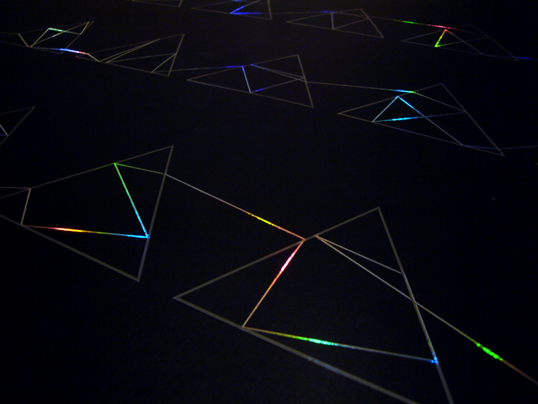

Storm Thorgerson- Poster Design by Richard Holt
http://www.typetoken.net/icon/storm-thorgerson-—-poster/
...................................................................................................................................................................
To me this illustrates the point the designer is trying to make really well. From the the front the letters are jumbled up and it doesn't make sense, similar to a hypothetical situation of two people arguing.
To me this illustrates the point the designer is trying to make really well. From the the front the letters are jumbled up and it doesn't make sense, similar to a hypothetical situation of two people arguing.

Anamorphic illustration by Lex Wilson
http://www.flickr.com/photos/majorlazor/8033284413/in/photostream
...................................................................................................................................................................
The transparency of the bubble wrap creates some great natural lighting that makes the type stand out.


Magazine Cover design by Lo Siento
http://www.losiento.net/entry/81-magazine
...................................................................................................................................................................
Here the type doubles up as a logo and a pattern. I like how the type bleeds off the edge of the bag.

...................................................................................................................................................................
Style or aesthetic quality
I thought this was an unusual, interesting idea. I like the fact that its universal for a range of events. A good solution to a simple problem.
I thought this was an unusual, interesting idea. I like the fact that its universal for a range of events. A good solution to a simple problem.


Word Puzzle Universal Wrapping Paper by Fabio Milito, Francesca Guidotti
http://www.thedieline.com/blog/2011/3/9/word-puzzle-universal-wrapping-paper.html
...................................................................................................................................................................
The holes in the logo and other visuals perfectly synthetize the loss of bits of memory. The vivid colours instantly creates a visual identity thats easily recognisable.


Identity for Alzheimer Nederlands by Studio Dumbar
http://www.designer-daily.com/identity-for-alzheimer-nederlands-by-studio-dumbar-29235
..................................................................................................................................................................
This concept is for an asian food restaurant. I chose it because I like how it portrays the oriental style with a contemporary finish. I particularly like the use of geometric shapes and patterns.


Bambu visual identity by Bond
http://www.behance.net/gallery/BAMBU/4739207
..................................................................................................................................................................
This design is very elegant and sleek. It generates an aura of class and sophistication.


Packaging by Nathan Hull
http://lovelypackage.com/student-work-nathan-hull/
The black mounted on bright colours makes it stand out. The posters remind me of the swiss style design.


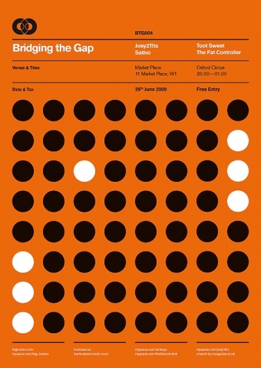
BTG Poster Series
http://designspiration.net/image/166539268438/
...................................................................................................................................................................
Structure & Layout
The long thin layout and structure of this info graphic reminds me of a beer bottle or label. The warm colour scheme has a relaxing, refreshing feel to it.

How beer saved the world info graphic by Spencer Sands
http://dailyinfographic.com/how-beer-saved-the-world-infographic
...................................................................................................................................................................
The type is cleverly arranged to allow the negative space to create the numbers.

Basic Typography- Ruedi Ruegg/ Godi Frohlich
http://www.flickr.com/photos/insect54/2250171581/
...................................................................................................................................................................
The layout of the type is balanced nicely with the photography, wrapping round the main features creating a free flowing design.

Jazz festival poster
http://designspiration.net/image/3726398906707/
...................................................................................................................................................................
The layout of the images,broken up by negative space helps to draw the eye towards the body copy.

http://designspiration.net/image/900933765046/
...................................................................................................................................................................
This layout uses a six column grid system. Its well organised with a simple colour scheme that clearly divides the body copy into sections.

This layout uses a six column grid system. Its well organised with a simple colour scheme that clearly divides the body copy into sections.

Editorial design
http://thenewblack.goffgough.com/post/12091517078
...................................................................................................................................................................
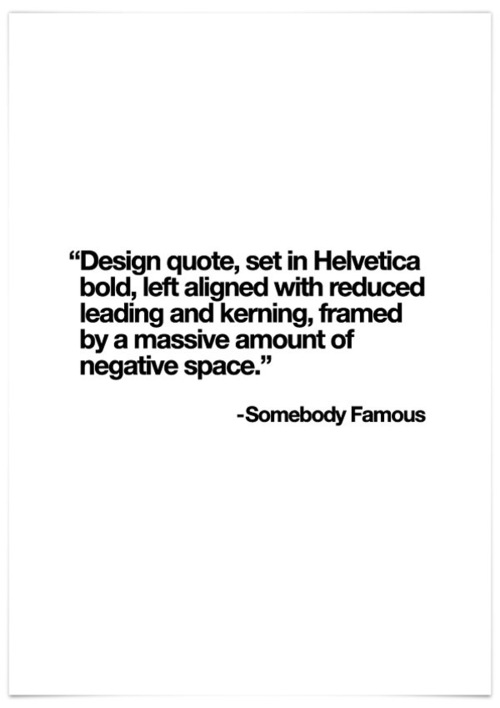
Use/Choice of language
Use/Choice of language
This design made me smile because I can relate to what it is saying. It also takes a well known hymn and adds a contemporary twist to it.

...................................................................................................................................................................
I chose this design because I have a sarcastic sense of humour. I like how the designer calls out the visual devices of each trend to reiterate the point he's trying to make.

...................................................................................................................................................................
This is a really bad joke but it made me laugh. I like how they have made it relevant to the target audience.

...................................................................................................................................................................
A clever reconstructed quotation from a movie that Im a fan of; 'Fight Club'.


Hand drawn typography by Simon Alander
http://www.typetoken.net/visual-language/hand-drawn-typography-by-simon-alander/
...................................................................................................................................................................

I found this really inspiring. I think this is a good message for young people today in a competitive, cut throat society.

Young and Fool by Wasted Rita
http://www.wastedrita.com/words/letter-to-a-sleeping-country/
...................................................................................................................................................................
I chose this design because I have a sarcastic sense of humour. I like how the designer calls out the visual devices of each trend to reiterate the point he's trying to make.
TTTTrends by Robert Wilson
http://bobwilson.co.uk/ttttrends
...................................................................................................................................................................
This is a really bad joke but it made me laugh. I like how they have made it relevant to the target audience.

Betype
https://www.facebook.com/pages/Betype/105123659637293
...................................................................................................................................................................
A clever reconstructed quotation from a movie that Im a fan of; 'Fight Club'.

Corporate motivational poster by Ink insurgent
http://www.flickr.com/photos/sdtv/5157056531/in/faves-grafiskanstalt/
No comments:
Post a Comment