In this session our blog groups laid out the 25 examples we had collected from the previous task.

We chose are favourite image from each category and answered five qualities that make good graphic design.

Function- To inform
Design Context- Branding
Tone of Voice- Formal
Message, Idea, Concept- Relaxing, Calming
Intended Scale or Place to be Viewed- A3, A4, A5, business card

Function- Promote, Advertise
Design Context- Magazine cover, Editorial
Tone of Voice- Young, Modern,
Message, Idea, Concept- Edgy, Experimental
Intended Scale or Place to be Viewed- A4

Function- Advertise, Promote
Design Context- Branding
Tone of Voice- Serious, Mature
Message, Idea, Concept- Elegant, Sleek, Sophisticated
Intended Scale or Place to be Viewed- High end restaurants
Function- To inform
Design Context- Info graphic
Tone of Voice- Light hearted
Message, Idea, Concept- Company history, Production process
Intended Scale or Place to be Viewed- Poster, Display next to product

Function- Humour
Design Context- Typographic poster
Tone of Voice- Contemporary, Light hearted
Message, Idea, Concept- Re-phrase, Rhyme
Intended Scale or Place to be Viewed- A3
Once we had completed this, In our blog groups, we compiled a list of each quality.
Function
- Inform
- Advertise
- Statement
- Creating awareness
- Humour
- Decretive
- Aesthetic
- Reflection
- Representation
- Gravitation
- Document
Design Context
- Advertising
- Fiction/Non fiction
- Informative design
- Branding
- Editorial
- Printed media
- Interaction
- Representation
- Packaging
- Installation
- Info graphics
- Typographic poster
- Illustration
- Visual impact
- Composition
- Playful
- Informative/Formative
- Humour
- Serious
- Emotive
- Quirky
- Light hearted
- Mature
- Contemporary
- Laid back
- Provoking
- Fun
- Serial
- Scientific
- Atmospheric
- Intelligent
- Inform
- Humour
- Self explanatory
- Promote
- Factual
- Identification
- Intelligent
- Use of type
- Communicate
- Temporary adoration
- Energy
- Safety
- Magazine advert
- Billboard
- Screen print
- Slideshow
- Exhibition
- Web
- Leaflet
- Poster
- Packaging
- Shop
- Restaurant
- Decoration
- Vinyl cover
- Logo
The final task we were set is ongoing and to identify a range of examples for each of these categories.
Identify a range examples of Graphic Design appearing in different design contexts
DTC / Te Huur
Het Compagnietheater
Shown below a small brochure we designed for Het Compagnietheater (the theatre hall in which De Theatercompagnie is housed) to bring to notice that this location can also be rented by third parties.
Basically a double-sided A3 poster, folded to an A5 booklet, one side shows all necessary information, to be read as separate pages, while the other side shows a typographic composition ('Te Huur', which means 'To Let' or 'For Rent'). Enclosed in this folder is an A5-sized cardboard insert with a perforation in the middle (to be used as two separate A6 postcards), showing two full-colour photographs, of the interior and exterior of the building.
First, the frontside of the A5 booklet:

The back- and frontside of the booklet, and the A5-sized card:


The inside spread of the booklet, and the backside of the A5-sized card:


Unfolded, the A5-sized booklet turns into a A3-sized mini-poster:

Brochure and card printed by Drukkerij robstolk (r).
link
Heinz Grunwald
FHV BBDO


Friends of Wilson
Friends of Wilson specialise in Architectural Acoustic wall products and installations that mediate between design, craft and art. The contemporary designs are suitable for a wide range of commercial, public and residential environments. The first task was to update the logo and design a marketing pack that would reflect the unique product in print. A folder containing three inserts was developed with intricate laser cutting on the folder’s overlapping pages. The finished result gives the end user a real insight into how the panels work. The complex patterns used for the folder design are taken from Lynne’s original architect illustrations. Also pictured here is the 2012 Product Brochure.

link
Lust

Visual representation to describe OCD.


 Shop making sense: The perceived importance of fashion as it relates to a quotation by designer Tom Ford, which first appeared in The New York Times: " On the day the planes went into the twin towers, we received 42 calls from customers looking for the purple peasant blouse.... The power of fashion can be a scary thing."


 Know your enemy: This article on the psychology of office politics broke down work personalities into six categories; shown here is "the passive aggressor," the person who cunningly stabs you in the back while looking you straight in the eye.


Revista Dale.
Year. 2010
Culture/ Music / Art Magazine.
link
Identify a range examples of Graphic Design performing different functions
Rob Ricketts

This series of informative posters by Rob Ricketts detailing how some of the most notable drum sequences were programmed using the Roland TR-808 Drum Machine.
link
Moma Design Studio


Project: MoMA Art Lab: People
Project Team: Julia Hoffmann (creative direction), H.Y. Ingrid Chou (art direction and design), Tony Lee (design and animation), Paulette Giguere (production artist)
Photos: Martin Seck, Tony Lee
Past Art Lab's: Material Lab, Line Lab, Shape Lab
Awards: Type Director's Club 2013
link

link
Patric Smith

Raising awareness of mental illnesses is an important part of erasing the stigma attached to those disorders. Graphic designer Patrick Smith created these minimalist posters that perfectly illustrate a number of mental disorders in flawless style.
Mental illness is no laughing matter, and Smith doesn’t present these disorders in jest. Rather, he is presenting them in terms that are easy to interpret visually. His intention when creating these posters was to offer them as part of a mental health awareness program.
The posters came about as a personal challenge for Smith after he read descriptions of many different mental disorders. The designer wanted to see if he could create attractive, informative and minimalist graphics that would explain each condition. Given the striking results, it seems that he was quite successful.
link
Gary Nicholson


Gary Nicholson is a graphic designer that specializes in work with type. His series of typographic jokes are really funny (at least for the dorky designers out there) and despite being fairly minimalistic, there are a few details that really complete the overall design. I think these are worth to showcase and any other funny puns anyone?
link
Ikko Tanaka

Born in Nara, Japan in 1930, Ikko Tanaka created a style of graphic design that fused modernism principles and aesthetics with the Japanese tradition. As a child he studied art and as a young adult he was involved in modern drama and theatrical study groups. In 1963 he formed Tanaka Design Studio where he worked for corporations such as Mazda, Hanae Mori, Issey Miyake and the International Garden and Greenery Exhibition.
He is most well-known for his poster design for the Nihon Buyo performance by the Asian Performing Arts Institute. The poster (pictured above) shows his fusion of modernist sensibilities and traditional Japanese culture through the simplified illustration of a geisha. He designed, among other things, posters, logos, packaging and annual reports. Among his wide ranging work, his designs for the symbols for the Expo '85 in Tsukuba and the World City Expo Tokyo '96 garnered much attention. He died in 2002 of a heart attack at the age of 71.


The Web Trend Map plots the Internet’s leading names and domains onto the Tokyo Metro map. Domains and personalities are carefully selected through dialogue with map enthusiasts, and every domain is evaluated based on traffic, revenue, and character.
Printed in Tokyo, Japan — a country known for high-quality printing
Printed on exquisite, heavy weight, matte paper
A0 sized print (841 mm × 1189 mm / 33.25 in × 46.75 in) allows for incredible design nuance and detail
Shipped in a robust, thick-walled tube for maximum protection
Marin Dearie

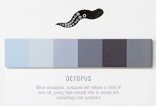


For her graphic design project, New Orleans-based artist Marin Dearie has created minimalist posters “to highlight the various color changes that occur in nature, popular culture, and elsewhere”, she wrote.
In her series, entitled ‘Shades of Change’, Dearie documented color-changing spectrums of tea brewing, an octopus’ dark ink, Lil’ Kim’s hair, Michael Jackson’s skin, a smoker’s lungs, the growth of an egg to a chicken, and a human tongue when licking a tootise pop.
Identify a range examples of Graphic Design communicating different types of messages/ideas/concepts


A.maz.ing.ly designed app for creating music on your iPhone. Great graphic design, information design, interface design.
Swedish software firm Propellerhead (the makers of Reason) put together not only a simple eye appealing music making app but one that has controls that will have you making music in just a few minutes.
link
Shahir Zag


Dubai-based creative and chief creative officer at Y&R MENA, Shahir Zag, pulls brilliant slogan visuals out of his brain like how people pull long faces on Mondays. Love the design-centric humour in these graphic posts on his site.
link
Graphic Design / Direct Mail (Graphic Design)
Blackpool School of Arts Promotional Poster


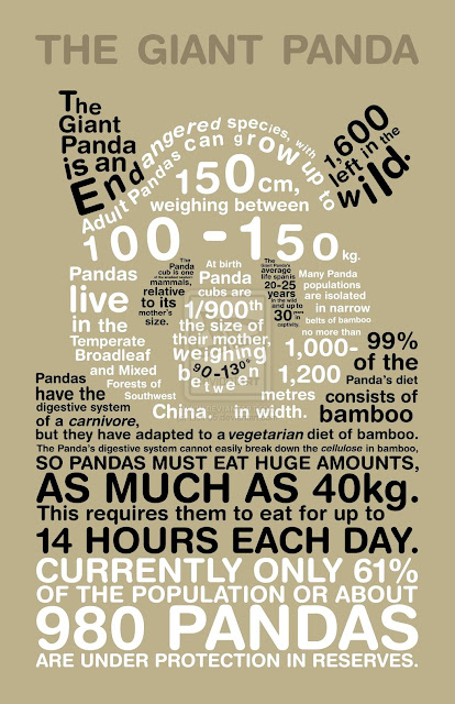
Panda Infographic


Brandversations is an interesting project by Romania-based graphic designer Stefan Asafti. He has very intelligently switched thelogos and slogans of the brands amongst themselves, ironically representing their rivalry.
"It is surprising how logos can influence other logos. The truth is that each pair of rivals has something in common, that something which has helped them to build one identity upon the other, this way becoming the biggest brands." - Stefan Asafti
Patrik Svensson


Swedish illustrator and graphics designer Patrik Svenssonhas created a fantastically minimalist series of typography posters. The project is a visualisation of various movies by using only letters from title or other typography characters.
link
helvetiac

Entry for Veerle's poster competition "What is Graphic Design?".
link
Mike Joyce


 swissted is an ongoing project by graphic designer mike joyce, owner of stereotype design in new york city. drawing from his love of punk rock and swiss modernism, two movements that have (almost) nothing to do with one another, mike has redesigned vintage punk, hardcore, new wave, and indie rock show flyers into international typographic style posters. each design is set in lowercase berthold akzidenz-grotesk medium (not helvetica).
link

The NHS Health Check programme aims to help prevent heart disease, stroke, diabetes and kidney disease.
Identify a range examples of Graphic Design using a different tone of voice.

And the last card for now is for a yoga instructor – where you fill in the gap in the picture to create a fun yoga finger puppet of sorts. Memorable, and again very simple to do with just two die cut holes turning what would otherwise be a simple card into more of a familiar toy to the recipient. Yoga is a demanding activity and there are many providers around, the card would be likely to raise a smile and therefore people would remember the friendly face of the instructor fondly because of it making going to classes less daunting – a clever piece of psychology in a tiny card
link

'Body Parts,' Esquire, magazine article, 2006
Design: Peter Grundy (Grundini). Art Direction: Alex Breuer
Posters 2010 by Tony Ziebetzki

THINK! It's 30 for a reason.
link

Specially designed for Tate, 100% cotton, bright, fun and quirky tote bag by graphics and illustration company Lazy Oaf.
link

Ten reversible cards with both black-and-white and color graphics help babies discover light/dark contrast and begin recognizing patterns. Hook-and-loop strap easily attaches to either front or rear-facing car seats. The Car Seat Gallery, with its research-proven graphics, has won the hearts of babies and parents everywhere, as well as numerous prestigious awards for its ingeniously simple design.
link
By Oriol Gil

Located in Barcelona city since 2010, Cornelia and Co is a restaurant, a bakery, a winery, a coffe shop and many other things. A place where you can buy many gourmet products, a pack of fresh pasta or take an exotic tea. Inspired in the graphic design of the central europe between the 30' and 40' (called "interwar years") all graphic materials are printed only in black ink and white serigraphy, over industrial raw papers and cardboards, honoring those years of poverty.
link

Kickstarter: Green Patriot Posters Documentary Short Green Patriot Posters brings together the strongest contemporary graphic design promoting sustainability and the fight against climate change. This campaign uses dynamic posters to encourage citizen participation in building a sustainable economy (created by The Canary Project). These posters can be general (“We Can Do It!”) or can promote a specific sustainability action.
link

link
 In a perfect world...
link
Identify a range examples of Graphic Design produced at different scales/places
- Advertising
- Fiction/Non fiction
- Informative design
- Branding
- Editorial
- Printed media
- Interaction
- Representation
- Packaging
- Installation
- Info graphics
- Typographic poster
- Illustration
- Visual impact
- Composition
Experimental Jetset
DTC / Te HuurHet Compagnietheater
Shown below a small brochure we designed for Het Compagnietheater (the theatre hall in which De Theatercompagnie is housed) to bring to notice that this location can also be rented by third parties.
Basically a double-sided A3 poster, folded to an A5 booklet, one side shows all necessary information, to be read as separate pages, while the other side shows a typographic composition ('Te Huur', which means 'To Let' or 'For Rent'). Enclosed in this folder is an A5-sized cardboard insert with a perforation in the middle (to be used as two separate A6 postcards), showing two full-colour photographs, of the interior and exterior of the building.
First, the frontside of the A5 booklet:
The back- and frontside of the booklet, and the A5-sized card:
The inside spread of the booklet, and the backside of the A5-sized card:
Unfolded, the A5-sized booklet turns into a A3-sized mini-poster:
Brochure and card printed by Drukkerij robstolk (r).
link
Heinz Grunwald
FHV BBDO

Communication just got Sweeter.
Personalise your M&M’s at mymms.nl
Advertising Agency: FHV BBDO, Amsterdam, The Netherlands
Creative Directors: Maarten v.d. Vijfeijken, Joris van Elk
Art Director: Yona Hümmels
Copywriter: Stef Jongenelen
Photographer: Studio Beerling
Retouch: Jeroen Schuyt
Account: Gepke Nederlof
Special thanks to: Jeffrey Metzner 1941 – 2008
Published: August 2008
Creative Directors: Maarten v.d. Vijfeijken, Joris van Elk
Art Director: Yona Hümmels
Copywriter: Stef Jongenelen
Photographer: Studio Beerling
Retouch: Jeroen Schuyt
Account: Gepke Nederlof
Special thanks to: Jeffrey Metzner 1941 – 2008
Published: August 2008
DANIEL BENNEWORTH-GRAY
GRAPHIC DESIGN


York-based graphic designer specialising in book cover design.
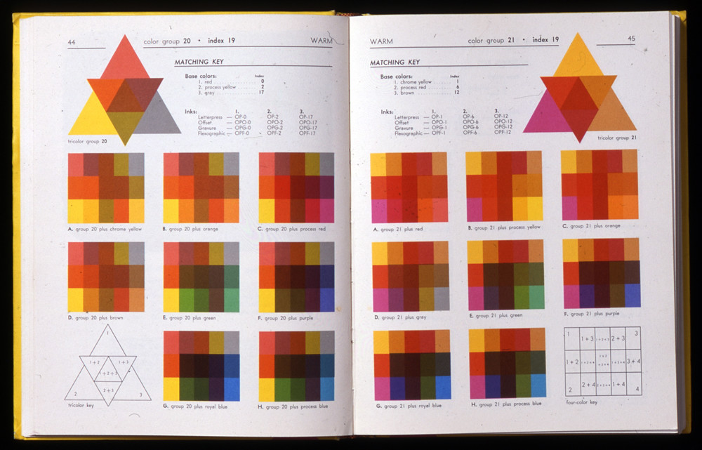
Overprinting016
Inside spread, offset lithography, Donald E. Cooke, Dramatic colour by overprinting (1974).
Given the typical limit of colour working in commercial print as four, Cooke combined colours first in groups of three whose overprinting effects were illustrated in the triangular diagram. A series of rectangular diagrams then introduced another colour into the original group of three to illustrate the set of colours thus generated. Repeated with all possible permutations of an eleven-colour palette, the book contained an extraordinary number of overprints that enable accurate colour planning and prediction.
KVGD studio


Friends of Wilson
Friends of Wilson specialise in Architectural Acoustic wall products and installations that mediate between design, craft and art. The contemporary designs are suitable for a wide range of commercial, public and residential environments. The first task was to update the logo and design a marketing pack that would reflect the unique product in print. A folder containing three inserts was developed with intricate laser cutting on the folder’s overlapping pages. The finished result gives the end user a real insight into how the panels work. The complex patterns used for the folder design are taken from Lynne’s original architect illustrations. Also pictured here is the 2012 Product Brochure.
Qubik Design 2013
A Continuous Series
A2 print for a typographic exhibition curated by Sophie McIntosh.
Studio Project, 2009
Print
A2 print for a typographic exhibition curated by Sophie McIntosh.
Studio Project, 2009
link
Lust


The Mondriaan Foundation was created to stimulate visual arts, design and the cultural heritage of the Netherlands. It's task is to strengthen the international position of contemporary visual arts and design by offering financial support to enable institutions, companies and authorities -both national and international- to reach their audience.
The Annual Report gives information about all the projects they (co-)financed, totalling more than thousand projects which were supported for as little as a hundred and to as much as millions of Euros. A typographical system which separates different levels of information as a thread forms the lay-out of the pages, and divided by 3-ring pie chart that graphs exactly what they spend on each project. Every page is printed on a different color paper, in a random order which is unique to each copy of the report. There are 8 different colors for the cover and more than 20 different colors for the inside.
Created by graphic designer Patrick Smith

Visual representation to describe OCD.

Visual representation to describe Narcolepsy
Nikolo Kerimov, Juho Kruskopf & Arttu Kuisma.
Designed by Nikolo Kerimov, Juho Kruskopf & Arttu Kuisma.
Country: Finland.
School: Lahti Institute of Design, Package and Graphic Design.
The packaging is a designed to be a sculptural, aesthetic and functional. By using the product, the packaging shapes into a different forms. Geometrical shapes create interesting patterns that live through the product.
Jury's comments: “This entry has huge business potential. It can be used for all kinds of product families, and can replace very big volumes of non-recyclable materials. The use of material is thoughtful, and the functionality and aesthetics of the texture make sense. Not revolutionary, but simple, OneEighty stands out as a production-ready design with extremely wide range of possible end use applications.”
Joseph Egan

Graphic design student, Joseph Egan, created this fantastic anamorphic typographic installation at Chelsea College of Art & Design, using the works of Felice Varini as an inspiration point. This type of art is something that even photographs cannot really justify.
The Consult
Labour Market Intelligence
Displaying heavy statistical information in an interesting and accessible way.
Mash Creative


Really Useful Posters
For the first in an ongoing set of prints we created a series of 4 themes for the 'This is my Really Useful Poster' series extending the philosophy & thinking behind our branded 'State of the Obvious' collection.
—
Available to buy as 200gsm Epson enhanced matt paper giclée prints in A0, A1 and A2 sizes exclusively from: www.print-process.com
—
Based on an idea co-created by Mark Bloom and Tony Coppin.
—
Available to buy as 200gsm Epson enhanced matt paper giclée prints in A0, A1 and A2 sizes exclusively from: www.print-process.com
—
Based on an idea co-created by Mark Bloom and Tony Coppin.
Noma Bar


The harder they come: No matter how severe a recession or how bleak the world seems, sex and the sex industry will always be on the rise.

Fat cat: The symbol for the British pound sterling chomps on a large cigar, rendering a 'fat cat' face for an article about how CEOs invest their personal wealth.

Images Sourced from the book 'Negative Space' by Noma Bar
Gonzalo Nogues


Revista Dale.
Year. 2010
Culture/ Music / Art Magazine.
link
Identify a range examples of Graphic Design performing different functions
- Inform
- Advertise
- Statement
- Creating awareness
- Humour
- Decretive
- Aesthetic
- Reflection
- Representation
- Gravitation
- Document
Rob Ricketts

This series of informative posters by Rob Ricketts detailing how some of the most notable drum sequences were programmed using the Roland TR-808 Drum Machine.
link
Moma Design Studio


Project: MoMA Art Lab: People
Project Team: Julia Hoffmann (creative direction), H.Y. Ingrid Chou (art direction and design), Tony Lee (design and animation), Paulette Giguere (production artist)
Photos: Martin Seck, Tony Lee
Past Art Lab's: Material Lab, Line Lab, Shape Lab
Awards: Type Director's Club 2013
link
Scott Stevenson

Scott Stevenson Poster 26x36
NAXART incorporates visually powerful graphic design with thought-provoking statements from leading creative minds. On the Scott Stevenson Poster, “Visual design is often the polar opposite of engineering: trading hard edges for subjective decisions based on gut feelings and personal experiences. It’s messy, unpredictable, and notoriously hard to measure. The apparently erratic behavior of artists drives engineers bananas. Their decisions seem arbitrary and risk everything with no guaranteed benefit.”link
Patric Smith

Raising awareness of mental illnesses is an important part of erasing the stigma attached to those disorders. Graphic designer Patrick Smith created these minimalist posters that perfectly illustrate a number of mental disorders in flawless style.
Mental illness is no laughing matter, and Smith doesn’t present these disorders in jest. Rather, he is presenting them in terms that are easy to interpret visually. His intention when creating these posters was to offer them as part of a mental health awareness program.
The posters came about as a personal challenge for Smith after he read descriptions of many different mental disorders. The designer wanted to see if he could create attractive, informative and minimalist graphics that would explain each condition. Given the striking results, it seems that he was quite successful.
link
Gary Nicholson


Gary Nicholson is a graphic designer that specializes in work with type. His series of typographic jokes are really funny (at least for the dorky designers out there) and despite being fairly minimalistic, there are a few details that really complete the overall design. I think these are worth to showcase and any other funny puns anyone?
link
Ikko Tanaka

Born in Nara, Japan in 1930, Ikko Tanaka created a style of graphic design that fused modernism principles and aesthetics with the Japanese tradition. As a child he studied art and as a young adult he was involved in modern drama and theatrical study groups. In 1963 he formed Tanaka Design Studio where he worked for corporations such as Mazda, Hanae Mori, Issey Miyake and the International Garden and Greenery Exhibition.
He is most well-known for his poster design for the Nihon Buyo performance by the Asian Performing Arts Institute. The poster (pictured above) shows his fusion of modernist sensibilities and traditional Japanese culture through the simplified illustration of a geisha. He designed, among other things, posters, logos, packaging and annual reports. Among his wide ranging work, his designs for the symbols for the Expo '85 in Tsukuba and the World City Expo Tokyo '96 garnered much attention. He died in 2002 of a heart attack at the age of 71.


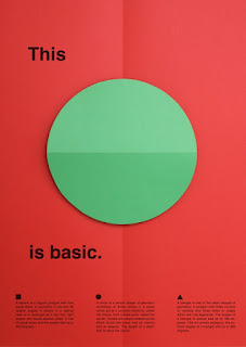
The series of posters is part of the installation 'This is Basic'. The big pop-up shapes are triangles, circles and squares, by unfolding the poster the shapes open up and become three-dimensional. This transformation highlights the effect of shadow and reflection on the surfaces and shades.
The series is limited to 8 basic colours, both used for the shapes and the background, that makes 192 possible combinations. The posters were presented at the exhibition Lift Off, during the Dutch Design Week 2008. The participants were; Gabriel Lester, Daniera ter Haar & Christoph Brach, Esther Stocker, Krijn Christiaansen & Cathelijne Montens, IJm studio, Thomas Bakker, Tejo Remy & Rene Veenhuizen, Sander Mulder, TTTVO, Maurer United Architects and Bob Copray.


The Web Trend Map plots the Internet’s leading names and domains onto the Tokyo Metro map. Domains and personalities are carefully selected through dialogue with map enthusiasts, and every domain is evaluated based on traffic, revenue, and character.
Printed in Tokyo, Japan — a country known for high-quality printing
Printed on exquisite, heavy weight, matte paper
A0 sized print (841 mm × 1189 mm / 33.25 in × 46.75 in) allows for incredible design nuance and detail
Shipped in a robust, thick-walled tube for maximum protection
Marin Dearie


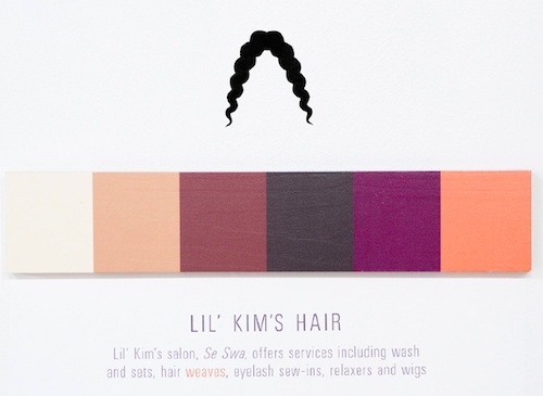


For her graphic design project, New Orleans-based artist Marin Dearie has created minimalist posters “to highlight the various color changes that occur in nature, popular culture, and elsewhere”, she wrote.
In her series, entitled ‘Shades of Change’, Dearie documented color-changing spectrums of tea brewing, an octopus’ dark ink, Lil’ Kim’s hair, Michael Jackson’s skin, a smoker’s lungs, the growth of an egg to a chicken, and a human tongue when licking a tootise pop.
Identify a range examples of Graphic Design communicating different types of messages/ideas/concepts
- Inform
- Humour
- Self explanatory
- Promote
- Factual
- Identification
- Intelligent
- Use of type
- Communicate
- Temporary adoration
- Energy
- Safety


A.maz.ing.ly designed app for creating music on your iPhone. Great graphic design, information design, interface design.
Swedish software firm Propellerhead (the makers of Reason) put together not only a simple eye appealing music making app but one that has controls that will have you making music in just a few minutes.
link
Shahir Zag


Dubai-based creative and chief creative officer at Y&R MENA, Shahir Zag, pulls brilliant slogan visuals out of his brain like how people pull long faces on Mondays. Love the design-centric humour in these graphic posts on his site.
Graphic Design / Direct Mail (Graphic Design)
Blackpool School of Arts Promotional Poster


- Designer
David Thompson - Creative Director
Peter Richardson - Design Company
The Chase - Account Handler
Paul Waters
Historically, Blackpool and The Fylde College had distanced itself from the stereotypical views of Blackpool. For this piece of direct mail, we opted to embrace everything Blackpool stood for, creating an identity that was ‘Blackpool’, and making the college instantly recognisable among the national competition. This poster was mailed as a teaser to prospective students before they received a prospectus. It also served as a promotional piece at the national student enrolment fairs. The poster uses the stripes from the new identity and is rolled and wrapped to mimic a traditional stick of Blackpool rock.
link
Lish-55
link
Lish-55

Panda Infographic

Stefan Asafti


Brandversations is an interesting project by Romania-based graphic designer Stefan Asafti. He has very intelligently switched thelogos and slogans of the brands amongst themselves, ironically representing their rivalry.
"It is surprising how logos can influence other logos. The truth is that each pair of rivals has something in common, that something which has helped them to build one identity upon the other, this way becoming the biggest brands." - Stefan Asafti
Patrik Svensson


Swedish illustrator and graphics designer Patrik Svenssonhas created a fantastically minimalist series of typography posters. The project is a visualisation of various movies by using only letters from title or other typography characters.
link
helvetiac

Entry for Veerle's poster competition "What is Graphic Design?".
link
Mike Joyce
swissted is an ongoing project by graphic designer mike joyce, owner of stereotype design in new york city. drawing from his love of punk rock and swiss modernism, two movements that have (almost) nothing to do with one another, mike has redesigned vintage punk, hardcore, new wave, and indie rock show flyers into international typographic style posters. each design is set in lowercase berthold akzidenz-grotesk medium (not helvetica). link

The NHS Health Check programme aims to help prevent heart disease, stroke, diabetes and kidney disease.
- Playful
- Informative/Formative
- Humour
- Serious
- Emotive
- Quirky
- Light hearted
- Mature
- Contemporary
- Laid back
- Provoking
- Fun
- Serial
- Scientific
- Atmospheric
- Intelligent

link

'Body Parts,' Esquire, magazine article, 2006
Design: Peter Grundy (Grundini). Art Direction: Alex Breuer


Posters 2010 by Tony Ziebetzki
By Charlie Finn

THINK! It's 30 for a reason.
Road Safety poster.
link

link
Ten reversible cards with both black-and-white and color graphics help babies discover light/dark contrast and begin recognizing patterns. Hook-and-loop strap easily attaches to either front or rear-facing car seats. The Car Seat Gallery, with its research-proven graphics, has won the hearts of babies and parents everywhere, as well as numerous prestigious awards for its ingeniously simple design.
link
By Oriol Gil

link

Kickstarter: Green Patriot Posters Documentary Short Green Patriot Posters brings together the strongest contemporary graphic design promoting sustainability and the fight against climate change. This campaign uses dynamic posters to encourage citizen participation in building a sustainable economy (created by The Canary Project). These posters can be general (“We Can Do It!”) or can promote a specific sustainability action.
link

«Tram» Tearoom promotional posters
By Dimis Giannakoulias
link
link
Identify a range examples of Graphic Design produced at different scales/places
- Magazine advert
- Billboard
- Screen print
- Slideshow
- Exhibition
- Web
- Leaflet
- Poster
- Packaging
- Shop
- Restaurant
- Decoration
- Vinyl cover
- Logo
No comments:
Post a Comment