Crit Friday 22.02.13
We had our first crit with Simon and Amber and pitched our concept to them. The feedback we received was that we had a good concept but had gone a bit of course as we will need to fulfil our brief for the next stage. We had to rethink the concept to be feasible to do.
We were given a blank brief to write and present to Amber.
Before we could write the brief we discussed in the group what we needed to adjust and the new direction we wanted to go in. We wanted to use some of the work we had already done but slightly alter it to fulfil the brief.
Concept:
To create a blog supported by social media that will promote the benefits of tea and create a discussion forum amongst tea drinkers
What do you want to say?
We want to make people aware of the benefits of tea and create a social forum where people can share and discuss their tea experiences.
How do you intend to say it?
By offering advice, hints, share experiences, recommendations
What language would be appropriate?
We want to communicate a vibrant and welcoming atmosphere through the use of informal and friendly language.
Will the content be communicated primarily through type or image?
We will use both type and image. Due to the limited colour palette the type will have to compliment the images to communicate our message.
What are you aiming to achieve?
We want people to share experiences and advice, create a forum where like minded tea drinkers can chat and enjoy being part of an online community.
Self written brief:
We presented our brief to Amber and explained what we wanted to achieve. The feedback was better and more realistic.
Progress Crit 01.03.13
We had our progress crit with Simon and two other groups. We presented our design sheets and explained what we were working on.
The feedback we received was positive, the concept and media we were proposing to design was focussed. Simon liked the idea of displaying the posters outside of college to reach a wider audience and the interactive elements to appeal to people who dont have access to the internet. The main advice we received was to organise our time and set deadlines for each persons area of work.
Final Presentation Friday 08.03.13
We had to present our work to the year group. We presented our concept and showed the work we had designed; type face, posters, leaflets, sticker, banners for tea cups, our blog, twitter page, youtube page and showed our video. We each discussed the areas we had been working on individually and answered questions as a group at the end.
Evaluation
We were given the topic 'drink tea' to communicate.
There was six of us in our group so we decided it would be best to delegate jobs to allow us to cover a wider range of research to inform the design decisions. We broke it down into different areas of research and I was given existing means of distribution. From the research I collected I found that twitter was the most effective way of getting people to interact. The internet was the main source I used to collect my research as twitter is an internet based platform. I think as a group, we could of collected some primary research by visiting cafes in town and talking to people to better inform our ideas. However, there were a lot of tea lovers on twitter and blogs that already had some of the data we needed.
The existing means of distribution we decided to utilise were Twitter, blog site and youtube. The twitter page was the most successful platform for interacting with people. However, the blog had a good response with the polls we conducted.
Individual Work
I was in charge of designing posters thats purpose was to direct people to the blog and twitter pages. I created a series of four posters, two with type and image and two with type. I wanted them to be high impact and grab the viewers attention but in a friendly, inviting manor. I think the colours we chose worked really well in communicating this because they are calming to look at. We displayed them around college and in a few cafes.
I also designed an interactive poster that intended to get people to record their favourite type of tea. This was displayed in the cafe at college and was really successful. I think it worked so well because it was really simple and quick to do.
Overal I am really pleased with my designs and particularly the success of the interactive poster. If I was to do it again I would display the posters in a lot more cafes in town to target tea drinkers.
Group Work
Logo
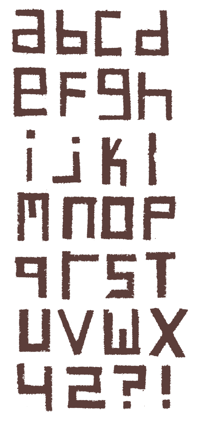
Tea Font
Leaflets
Sticker
Twitter Competition
I was really pleased with the group I was in and think we worked really well together. I particularly enjoyed the discussion we had at the start of the project, bouncing ideas off each other. I think this will be a beneficial skill to have when I come to work in the industry. It has made me realise I enjoy working with other people and being part of a team. This time working as a group, I feel we worked in a much more professional manor by delegating each other jobs to complete. I much prefer working like this as it relieves some of the stress and allowed us to cover a wider range of work. Everyone in the group was really committed and we all worked really hard to complete everything we set out to achieve.