Range/ Promotion/ Stationary


Once I have my logo designed I will be able to apply it across the range. I will need to thing about how to use different colours, inverted etc like above to make it more visually interesting.

I like the creativity of the example above, the elements can be connected to make characters. I like this idea but I don't think it represents me but its different to the standard self promotion pack.

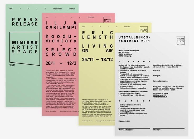
I love the minimal approach of these two examples. I think this style best communicates me and my interests within design but I want to include pastel colours with the stock.


I like in the example above how the letters have the usually clear panel filled with colour. I thin I am going to make my own letters using the pastel stock for colour.


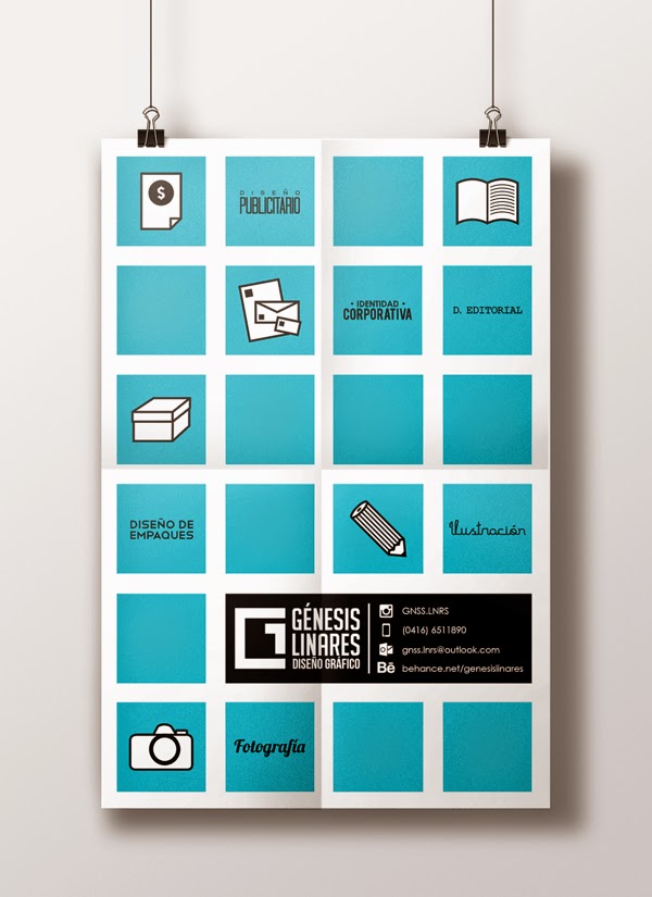
I like the use of symbols to illustrate my skills, strengths and expertise within design. I would like to design something similar for my creative cv.


The example above is something like what I have in mind. I want it to be simple and easy to understand. I want to use stock and one colour ink so it the simplicity will help with this.


This cv has been made into a poster style design. I like this idea as it can be folded down to go into a pack which I can make a range a posters to go with.

Business Card


The example above make good use of one colour plus stock. They all have the contact info on the back with the design on the front. I might have a bit of both on mine to make it clear what they are for and make them more personal.


I like the use of type on these cards with the soothing stock colours. I have started to appreciate type much more over the last year so I might focus on it in my designs.
General Inspiration


I could make a folder or use clips of some sort to bind the work together. I might try using the brown paper with bright colour but I'm not sure yet.


I like blues and greens so I think I want to include them some how in my work.


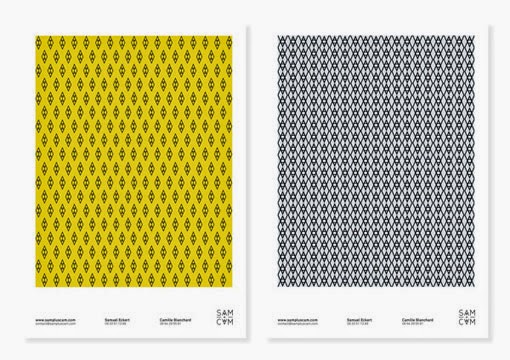
The examples above use geometric patterns, I think something like this could work well with black ink on pastel stock.


I really like these two images, there have modernistic characteristics that I like using a a five column grid for the type, I think I want my design to be structured and stick to a grid throughout for consistency.

A sketch book could be a nice thing to include in the stationary range. I like the wire bounding as well, something to consider when applying my brand across the range.

I like the idea of having pages at different sizes, this could be a good way to display some of my own work.


I could make info graphics to show my interests and ideas like above. These could be smaller and in different coloured stock.
Aesthetics

This example is the kind of style I am wanting to achieve. I like the use of different stocks with one colour. I want to use black ink in my designs so they will need to be simple with impact.

I think some promotional posters to showcase my style and ideas would be a good thing to include.


I really like the idea of transferring the pastel colours to a digital space for my website design. The colours could be used to organise the different fields of design I have done work for.


Illustrations could be a nice way of breaking up the pack and letting the eye rest with the neagativev space.


I think the metal binding could look good with the colours and quick and simple to construct. I want my pack to be really simple in design and production to reflect me and my ideas of design. I think design should varies on the purpose but in general, stripping things back to the essentials make a well balanced, lasting designs.


No comments:
Post a Comment